Introduction
Walk an exhibit hall and you have roughly three seconds to catch a passing attendee's attention — that's the industry standard cited by EXHIBITOR magazine. In a global industry that welcomed 318 million visitors and generated $398 billion in economic output in 2024, the competition for those three seconds is fierce.
Trade show display graphics are the custom-printed visual panels and branded materials — fabric backwalls, SEG displays, banner graphics, table covers — that form a company's entire visual presence on the show floor. Getting them right directly affects lead quality, brand perception, and cost per contact — which makes it one of the higher-stakes production decisions in your event budget.
If you're a B2B marketer, event manager, or designer responsible for booth graphics, this guide covers what you need to know: the main formats, how printing works, what makes booth design effective, and the mistakes that cost exhibitors money every show season.
Key Takeaways
- Each display format — backwalls, SEG panels, retractable banners, and more — requires a specific material and printing method
- Dye-sublimation is the industry standard for fabric graphics, producing washable, fade-resistant prints that hold up through repeated use
- Effective booth graphics follow a three-zone logic: long-range for brand ID, mid-range to pull attendees in, short-range to communicate detail
- RGB files, low-resolution images, and overcrowded layouts are the most common — and costly — mistakes exhibitors make
- When a frame is structurally sound, replacing graphics alone — not the whole display — is the more cost-effective move
What Are Trade Show Display Graphics?
Trade show display graphics are the custom-printed visual components that form the branded surface of an exhibit booth: fabric panels, backlit films, vinyl wraps, and banner rolls. They serve as a company's primary visual identity on the show floor.
Their job is specific — stop foot traffic, communicate brand identity within seconds, and draw attendees into the booth space.
Types of Trade Show Display Graphics
Each display format has a distinct construction and function:
- Pillowcase/stretch fabric — slides over a tension fabric frame like a fitted sleeve; common for straight and curved backwalls
- Silicone Edge Graphics (SEG) — a dye-sublimated fabric with a thin silicone strip along the edges, pressed into an aluminum channel for a taut, frameless finish
- Backlit translucent fabric — engineered to transmit LED light evenly through the panel; requires a light box frame with internal LED arrays
- Retractable banner graphics — polyester or vinyl rolls that retract into a base housing for protected transport
- Table cover graphics — drape or fitted stretch polyester printed for branded table presentations, available in throw or form-fitting styles
Graphic format is determined by the display frame you own. Pillowcase fabric works on tension backwall frames; SEG goes into channel-profile frames; retractable graphics fit specific banner stand hardware. Matching format to frame isn't optional.
Materials Used in Trade Show Graphics
| Material | Common Use | Key Characteristic |
|---|---|---|
| Stretch/woven polyester | Tension fabric displays, SEG | Lightweight, collapsible, dye-sub printable |
| PVC/Komatex | Rigid modular panels, 3D lettering | Durable, structured, adds weight |
| Pressure-sensitive vinyl | Wraps, logo applications | Adhesive-backed, surface-applied |
| Clear acrylic | Backlit elements, dimensional features | Premium visual finish, heavier |
| Foam core | Freestanding signage | Lightweight rigid board |
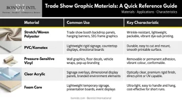
Material choice directly affects shipping weight, drayage costs, and visual finish. Fabric is lightweight and collapsible — a real advantage when display hardware is subject to weight-based drayage fees. PVC and acrylic add weight but deliver a structured, premium look appropriate for high-end installations.
Understanding which materials suit your booth format sets the foundation for every design and print decision that follows.
How Trade Show Display Graphics Are Printed
Dye-Sublimation: The Industry Standard for Fabric
Dye-sublimation is the dominant printing process for fabric-based trade show graphics — and it works differently from every other print method. Rather than depositing ink on the fabric surface, the process permanently bonds ink into the polyester fiber structure itself.
Here's how it works in three steps:
- Artwork is printed onto transfer paper using heat-sensitive dye-sublimation inks
- Transfer paper is pressed against polyester fabric at approximately 400°F — Roland DGA confirms this temperature as the point where ink converts from solid to gas
- The gaseous ink bonds permanently with the polymer fibers, producing a result that won't chip, peel, crack, or fade through repeated use and can be machine washed
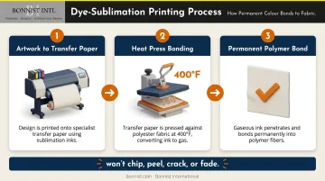
Dye-sub graphics handle the physical demands of trade show life — packed, shipped, unpacked, and re-stretched show after show — better than any surface-applied alternative.
Direct-to-Substrate Printing for Rigid Elements
Where dye-sublimation handles fabric, flatbed (direct-to-substrate) printing covers the rigid side of a display — PVC, foam core, acrylic — applying ink directly to the surface. This method is common for smaller high-detail elements, modular rigid panels, and dimensional display components. It is not appropriate for large flexible fabric displays.
G7 Color Management Certification
Color consistency breaks down across multi-panel displays and repeat reorders without disciplined color management. G7 Master Facility Certification — administered by PRINTING United Alliance — independently verifies consistent, color-accurate output across different substrates, inks, and workflows. For trade show graphics specifically, this matters when your brand color must look identical across six panels printed months apart. Before commissioning large-format graphics, ask your vendor directly whether they hold G7 certification.
How to Design Effective Trade Show Booth Graphics
Trade show booth graphics operate under visual constraints that don't exist in standard print or digital marketing. The viewer may be 10 to 100 feet away, moving through a crowded aisle, under inconsistent convention center lighting. Design for that environment — not for close-up reading.
Resolution, File Format, and Color
Technical specifications matter here. Getting them wrong means reprinting.
- Resolution: 100 DPI at full output size is the industry standard for large-format fabric graphics. A 10-foot-wide graphic needs source images at least 12,000 pixels wide
- File formats: PDF, AI, EPS, or PSD — not GIF, PNG, BMP, or PowerPoint exports
- Vector files for logos and type: They scale without quality loss — essential for crisp large-format outputVector files for logos and type: They scale without quality loss — essential for crisp large-format output
- Color mode: Submit files in CMYK, not RGB. Screen RGB values don't translate directly to print — warm tones in particular can shift under convention center LED or fluorescent lighting. Request a physical proof before the full production run
Text, Messaging, and Hierarchy
The billboard rule applies directly to trade show graphics. EXHIBITOR's research supports keeping primary copy to 6–10 words — the range a passing attendee absorbs in a three-second glance.
Apply this hierarchy:
- Logo — first thing visible from the aisle
- Value statement — short headline, what you do or why it matters
- Supporting detail — only in short-range zones where attendees are already engaged
Headlines should be legible from at least 10 feet away. Avoid thin-stroked decorative fonts — they collapse at distance. Body copy paragraphs on a backwall don't get read.
Color, Contrast, and Brand Alignment
Bold, high-contrast color combinations read better at distance. Dark backgrounds with vibrant foreground elements are particularly effective for backlit displays, where the illumination amplifies contrast.
Use your brand's Pantone colors as the reference point, but convert to CMYK equivalents for large-format printing. Pantone Connect can generate nearest CMYK equivalents for any Pantone swatch. Note that colors appear differently under warm versus cool venue lighting — reviewing proofs under similar lighting conditions before the show is worth the extra step.
Logo Placement and Imagery
Place logos high. The uppermost portion of a 10-foot backwall is prime real estate — booth staff standing in front of the display will block anything placed lower than 6 feet. Logo visibility from the aisle is non-negotiable.
For imagery, bold visuals against simple backgrounds create the strongest results. Photography should be purchased at the largest available file size — undersized stock images are one of the most common reasons for pixelated output at scale.
Imagery that reflects a brand's actual world consistently outperforms generic stock. The right visual varies by context:
- Sports organizations: fan energy, in-game action, athlete moments
- Corporate brands: executive environments, team culture, workspace settings
- Hospitality: the atmosphere and sensory experience guests encounter on-site
Bonnist International's backlit SEG display for the Excellent Leadership H2 Summit illustrates the difference. The graphic combined football imagery with polished executive typography — connecting sports culture to corporate authority in a single frame. For brands operating across sports, corporate, or hospitality environments, that kind of context-specific imagery does more work than layout refinements alone.
The Three Zones of Trade Show Graphic Placement
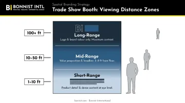
Booth graphics work by viewing distance, not uniform coverage. EXHIBITOR's graphics framework and Nimlok's exhibition guidelines both describe the same three-zone logic:
Long-range (100+ feet) — Brand identification only. Logo, brand color, signature visual. Maximum contrast, zero detail. Place as high as display or venue rules allow — hanging signs, tower displays, or the upper section of island booth structures.
Mid-range (10–50 feet) — Pull attendees in. Clear value proposition, short headline, or key product visual. Positioned on the outer backwall of island or peninsula displays, or the main backwall face of inline displays. Target between 5 and 8 feet from the floor, just above eye level.
Short-range (1–10 feet) — Engage and inform. The only zone where smaller text and denser content make sense. Product descriptions, infographics, company details. Mount at eye level (5–6 feet from the ground), readable once an attendee is already standing in front of your booth.
Design each zone independently. What reads from 50 feet — high contrast, minimal copy — will look sparse and incomplete at 5 feet. What works up close will be unreadable from across the aisle.
Common Mistakes When Designing and Printing Trade Show Graphics
Production Errors
- RGB files cause unpredictable color shifts at print — always submit in CMYK
- Low-resolution raster images pixelate at large scale — and there's no fixing it after production
- Skipping the vendor's frame-specific template leads to misalignment with zipper channels, silicone edges, or frame borders
- Skipping the physical proof — digital proofs are RGB and low-resolution, suitable for layout review only, not color accuracy. Review a physical proof under lighting similar to the venue
Design Errors
- Overcrowding the backwall with your full brand story undermines all of it
- A logo placed too low gets blocked by booth staff — and the graphic loses its most important visual anchor
- Decorative or thin-stroked fonts look refined up close and illegible at 10 feet
- No clear focal point — the graphic's job is to create curiosity and stop people, not replace a brochure
The Backlit Fabric Misconception
Many exhibitors assume a standard opaque fabric graphic placed on a backlit frame will produce an illuminated effect. It won't. Backlit displays require a specific translucent polyester material engineered for even light transmission — standard fabric on a backlit frame produces a washed-out, dim result.
The reverse causes problems too. Backlit translucent fabric on a non-illuminated frame looks faded and flat. The material and the frame must be matched from the start.
When to Replace vs. Refresh Your Trade Show Display Graphics
Display frames — especially tension fabric and pop-up systems — are built to last through years of regular show use. Graphics wear out faster. In a well-maintained frame, fading, surface damage, and wrinkling typically show up before any structural issues do.
Replace the graphic, not the display, when:
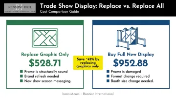
- The frame is structurally sound but visuals are dated or worn
- The brand has rebranded or updated its messaging
- Imagery or campaign content needs refreshing for a new show season
Buy a new full display when:
- The frame is physically damaged or structurally compromised
- The format needs to change — for example, moving from a standard backwall to a backlit system requires a different frame with internal LED arrays
- The booth footprint size needs to change
For cost reference: Orbus Displays lists a complete 10-foot Hop Up Straight Fabric Display kit — frame, graphic, feet, and carry bag — at $952.88. The replacement graphic alone starts at $528.71. When the frame is sound, swapping only the graphic saves about 45% — a straightforward way to show up with fresh visuals without replacing equipment that still works.
Frequently Asked Questions
What resolution should trade show display graphics be for large-format printing?
100 DPI at full output size is the standard for large-format fabric graphics. For a 10-foot-wide display, that means source images need to be at least 12,000 pixels wide. Always use vector files (AI, EPS) for logos and type — they scale without quality loss regardless of output size.
What is the difference between dye-sublimation and direct-to-substrate printing for trade show graphics?
Dye-sublimation is used for polyester fabric displays and bonds ink permanently into the fiber — vibrant, washable, and fade-resistant. Direct-to-substrate printing applies ink to the surface of rigid materials like PVC, foam core, or acrylic. Your display format determines which process is right for the job.
Should I use fabric or vinyl for my trade show booth graphics?
Fabric (dye-sublimation polyester) is standard for large-format backwalls and tension displays — lightweight, portable, wrinkle-resistant when stretched, and reusable across multiple shows. Vinyl suits rigid surface applications, wraps, or smaller branded elements. The display frame type ultimately determines the correct material.
How much text should I include on trade show display graphics?
Apply the billboard rule: 10 words or fewer for primary copy. A graphic that can't communicate its core message in three seconds loses the attendee. Detailed product or company information belongs in printed collateral, not on the backwall.
When should I replace my trade show display graphics instead of buying a new display?
Replace graphics when the frame is sound but visuals are outdated, branding has changed, or messaging needs updating. Invest in a new full display only when the frame is damaged, the format needs to change, or a different booth size is required.