These mistakes happen constantly across sports venues, corporate lobbies, hospitality installations, and event environments. Almost every one of them is preventable.
This guide covers 10 expert tips for large format printing — from file preparation through final installation — designed for B2B buyers who need professional results at scale.
Key Takeaways
- Always design in CMYK, not RGB, to avoid color shifts during printing
- Use vector files for all logos, text, and illustrations — they scale without quality loss
- Factor in viewing distance when setting resolution — closer viewing demands higher DPI
- Always request a proof before committing to a full production run
- Choose substrate and ink based on where the piece installs and how long it needs to last
Pre-Production Essentials: Getting Your Files Print-Ready (Tips 1–3)
The most common causes of failed large format prints happen before anything touches a press. Poor file preparation, wrong color modes, and low-resolution assets account for the majority of reprints and delays. Tips 1–3 address the foundational digital hygiene that separates professional results from costly do-overs.
Tip 1: Set the Right DPI for Your Output Size and Viewing Distance
Resolution requirements for large format printing are not one-size-fits-all. As HP notes, required resolution actually decreases as viewing distance increases — meaning a 40-foot stadium banner doesn't need the same DPI as a lobby poster viewed from arm's length.
Here's a practical framework:
- 300 DPI: Standard for close-viewing prints (retail posters, framed lobby displays, fine art reproduction)
- 120–150 DPI: Preferred by many large-format vendors for raster art at standard sign sizes, per FASTSIGNS pre-press guidelines
- 100 DPI minimum: Adobe's benchmark for poster output — acceptable for large prints viewed from a distance
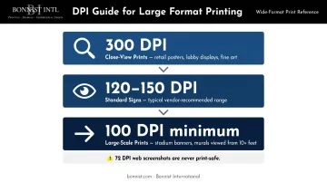
72 DPI web screenshots are never print-safe. Adobe classifies that resolution as suitable for small icons only. When sourcing assets, always download the highest-resolution original file available — not a screen capture or exported preview.
When in doubt, ask your print partner what resolution they recommend for your specific substrate and expected viewing distance. There's no universal formula — the right answer depends on the job.
Tip 2: Choose the Correct File Format
Not all file formats hold up equally at print scale. The vector-vs.-raster distinction is the most consequential format decision you'll make — especially once your artwork scales to banner or wall-wrap dimensions.
Vector formats (AI, EPS, SVG, PDF):
- Defined by mathematical paths, not pixels
- Resolution-independent — scale from a business card to a building without quality loss
- Ideal for logos, icons, text, and flat illustrations
- EPS is the traditional standard for commercial printing; PDF is widely accepted by most vendors
Raster formats (JPEG, PNG, TIFF, RAW):
- Pixel-based — quality degrades when enlarged
- Appropriate for photography and complex imagery
- TIFF is preferred for high-quality lossless image data
- RAW files preserve maximum photographic data before print preparation
Never resize or upscale a raster file to meet resolution requirements. Enlarging a low-resolution image doesn't add detail — it just makes the pixelation more visible at print scale.
Tip 3: Convert RGB Colors to CMYK Before Submitting Files
Screens render color using RGB (red, green, blue), a light-based system capable of producing vivid, saturated hues. Professional printers output in CMYK (cyan, magenta, yellow, black), an ink-based system with a narrower color gamut.
Submitting an RGB file forces the printer's RIP software to auto-convert it — and that conversion can shift your colors significantly. Adobe confirms that saturated and neon hues frequently fall outside CMYK's reproducible range, making gamut mapping unpredictable.
Best practice:
- Set your design software (Illustrator, InDesign, Photoshop) to CMYK color mode at project start — not as a last-minute conversion
- Use soft proofing tools to simulate how colors will appear on your specific printer and substrate
- Expect colors to look slightly duller on screen in CMYK mode — that's normal and accurate
Design Best Practices That Scale (Tips 4–6)
Once your files are correctly set up, design decisions around image types, margins, and typography determine whether a print looks polished at billboard scale or falls apart at three feet.
Tip 4: Use Vector Graphics for All Logos, Text, and Illustrations
Adobe defines vector graphics as mathematical descriptions of lines, curves, and colors — not pixels. That means a vector logo scales from a pocket card to a 40-foot banner without losing a single sharp edge.
For large format printing, any logo, icon, or typographic element should be in vector format. If you only have a raster version of your logo (a JPEG or PNG), have it redrawn as a vector in Adobe Illustrator before submitting.
One critical step designers often overlook: convert all fonts to outlines before sending files to a vendor (in Illustrator: Type > Create Outlines). This embeds the letterforms as vector shapes, eliminating font substitution errors when the file is opened on a machine that doesn't have your typeface installed. Note that outlined text loses normal text-editing properties — always keep an editable copy of the original file.
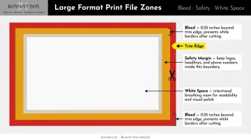
Tip 5: Include Proper Bleed, Safety Margins, and White Space
Three spatial elements govern how a large format piece survives the cutting and finishing process — and how clearly it reads once installed:
- Bleed: Artwork extended beyond the trim edge so no white borders appear after cutting. FASTSIGNS and Signs.com both require 0.25 inches minimum; confirm the spec with your vendor before finalizing files.
- Safety zone: The margin inside the trim edge where no critical content (logos, phone numbers, headlines) should sit. For vinyl banners, Banners.com recommends at least 2 inches from the edges, clear of hems and grommets.
- White space: At large scale, a cluttered composition reduces readability fast. White space gives the eye a resting point and signals intentional design — something that matters particularly in corporate and hospitality environments where brand sophistication is part of the message.
Tip 6: Size Typography to Viewing Distance
The standard vendor rule of thumb, cited by Signs.com: 1 inch of letter height per 10 feet of viewing distance. Text meant to be read from 50 feet needs lettering at least 5 inches tall.
ADA signage requirements and formal legibility indices use context-dependent calculations based on mounting height and viewing angle. For compliance-sensitive environments, your print partner or a signage consultant can advise on the specifics.
Typeface selection matters just as much as size:
- Choose clean sans-serif or bold serif fonts for headlines and critical information
- Avoid decorative scripts at large scale — they lose legibility when read from a moving vehicle or across a large venue
- Test legibility by reducing a proof to a small size — if you can't read it small, you won't read it fast at full scale
Substrate and Ink Selection (Tips 7–8)
Even a perfectly prepared file will underperform if it's printed on the wrong material or with the wrong ink technology. These decisions should be driven by the installation environment, expected lifespan, and aesthetic requirements of the project.
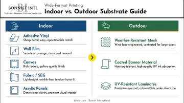
Tip 7: Match Your Substrate to the Environment and Application
The indoor vs. outdoor distinction drives most substrate decisions:
| Environment | Common Substrates | Primary Requirements |
|---|---|---|
| Indoor | Adhesive vinyl, wall film, canvas, fabric/SEG, acrylic panels | Visual quality, aesthetics, clean installation |
| Outdoor | Weather-resistant mesh, coated banner material, UV-resistant laminates | UV resistance, moisture tolerance, wind load |
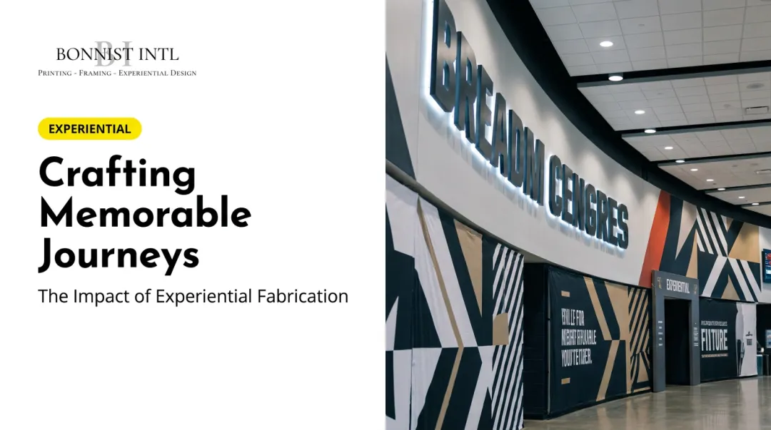
Industry context also shapes the decision. Sports venues, for instance, demand weather-resistant materials — Bonnist International's mesh windscreens for NYCFC span 8 feet by 35 feet and carry team and sponsor branding around training facility perimeters while holding color under outdoor conditions.
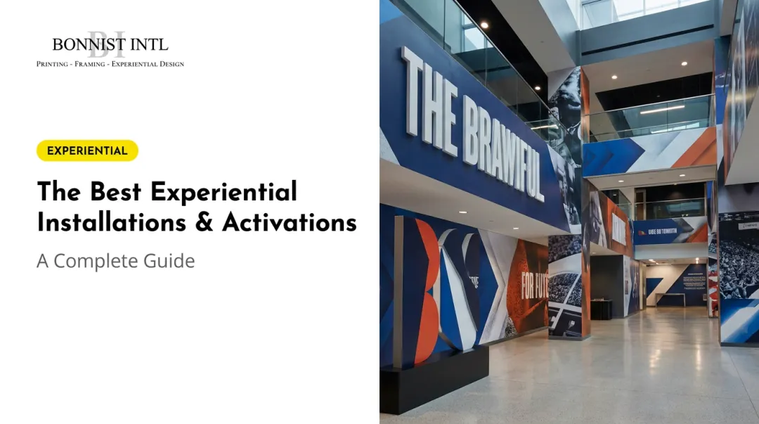
Hospitality projects call for a different calculus. Bonnist's work at MSocial Hotel NYC used Dreamscape wallpaper across 450+ guest rooms — chosen specifically for its texture and ability to render high-definition imagery at luxury quality. Corporate spaces often lean toward direct-to-acrylic printing, which produces gallery-quality lobby and corridor displays, as seen at Madison Square Garden.
Surface preparation is non-negotiable. Avery Dennison specifies that wall graphic surfaces must be clean, smooth, and dry before application, with an application temperature range of 50°F to 95°F. Newly painted surfaces should cure for 7 days before vinyl is applied.
Tip 8: Select the Right Ink Technology for Durability and Color Fidelity
Five ink technologies dominate wide-format production, per Wide-Format Impressions:
- UV-cured — highly durable, fast-drying, ideal for rigid substrates and outdoor use
- Latex (resin-based) — water-based, versatile across vinyl and fabric, with strong color retention under light exposure
- Eco-solvent — lower VOCs, solid performance on flexible indoor/outdoor media
- Dye-sublimation — best for fabric, delivers photographic-quality color reproduction
- Aqueous pigment — the standard for fine art reproduction and high-end photographic output
For high-visibility environments — arena graphics, hotel lobby murals, event backdrops — protective overlaminates extend vibrancy and resist scratching. Avery Dennison's digital overlaminate series specifically addresses UV resistance, scratch protection, and environmental durability. Ask your print vendor which laminate is appropriate for your specific media and ink combination.
Print Settings, Proofing, and Quality Control (Tips 9–10)
Tip 9: Optimize Print Settings to Match Your Media and Image
Correct files can still produce poor output if the printer isn't calibrated to the specific media. Always confirm that:
- The media profile matches the substrate loaded (gloss vinyl, matte canvas, mesh, etc.)
- The printer's output resolution matches the file's native resolution
- The monitor is calibrated — X-Rite recommends updating monitor profiles at least every two weeks
Mismatched profiles cause banding, color shifts, and uneven ink coverage. Adobe confirms that soft proofing reliability depends on monitor quality, output profiles, and ambient lighting — meaning a miscalibrated screen will undermine color accuracy even when the underlying files are correct.
Most professional design programs (Photoshop, Illustrator) include soft proofing tools that simulate a specific printer-and-media combination before production begins. Use them.
Soft proofing gets you close — but nothing replaces a physical proof before a full run begins.
Tip 10: Always Request a Proof Before Committing to Full Production
A proof is a test print produced on the same printer and media as the final job. For large-scale commercial projects, it's the final checkpoint for catching:
- Color shifts not visible on screen
- Banding or ink coverage issues
- Font rendering or substitution errors
- Bleed accuracy and trim alignment
- Any design element that reads differently at actual scale
One detail buyers frequently miss: assess the proof in the intended lighting environment. X-Rite notes that D50 (5000K) is the standard for graphic arts viewing booths, but most installations — hotels, arenas, retail spaces — use controlled ambient lighting that shifts color perception.
A print that looks accurate under fluorescent office light may read very differently under LED downlights or natural daylight.
For Bonnist International's projects, client approval of final designs is built into the production workflow before any large-scale run proceeds — a step that protects both parties from costly reprints.
Post-Print Handling, Storage, and Installation Best Practices
A perfect print can be damaged before it ever reaches the wall. The right handling, storage, and installation practices protect that investment at every stage.
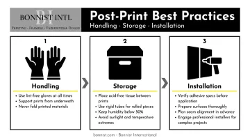
Handling:
- Use clean, lint-free gloves when touching print surfaces
- Support large prints from underneath with both hands — or a second person — to prevent creasing
- Never fold prints; keep them flat or loosely rolled
Storage:
- Separate stacked prints with acid-free tissue paper
- Store flat prints in archival portfolios or flat files
- Use rigid tubes with end caps for rolled prints
- The Library of Congress recommends keeping inkjet print storage humidity below 50% and temperatures as low as practically possible to slow degradation
- Keep stored prints away from direct sunlight, temperature extremes, and high humidity
Installation:
- Verify adhesive specifications match the substrate and surface material before ordering
- Prepare surfaces thoroughly — clean, dry, and primed — before any graphic goes up
- Plan seam alignment in advance, especially for multi-panel murals or environmental wraps
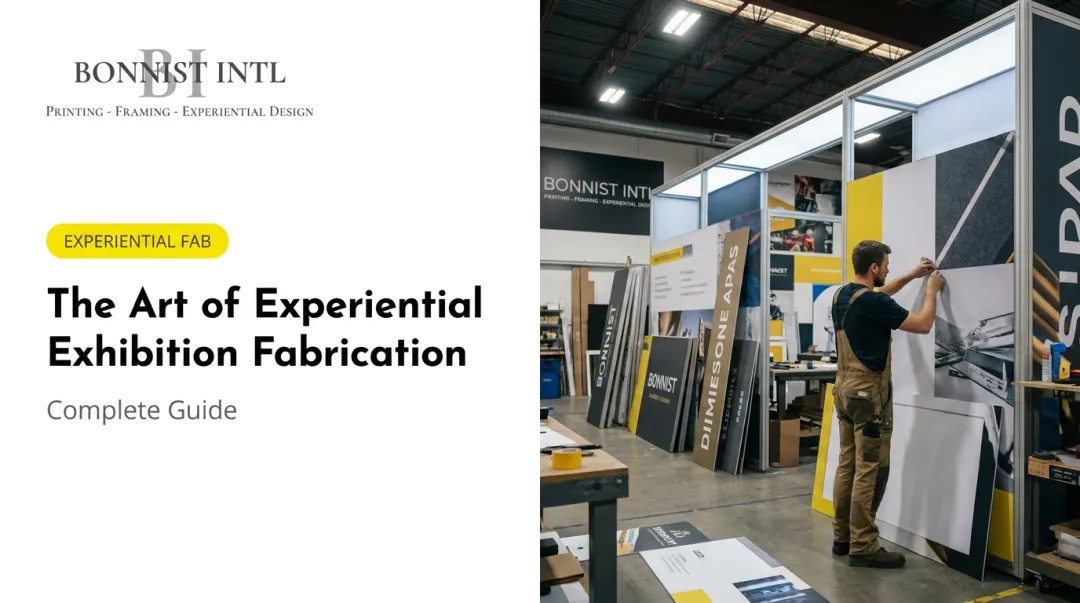
- Engage experienced installers for complex projects: stadium wraps, hospitality murals, and multi-wall graphics require precision that DIY approaches rarely deliver
For large-scale commercial installations, Bonnist International handles the full process — from print production through on-site installation — across stadiums, corporate environments, and hospitality spaces, drawing on 33 years of visual display fabrication experience.
Frequently Asked Questions
What DPI should large format printing files be?
The right DPI depends on viewing distance. Close-viewing prints like retail posters or lobby displays typically need 300 DPI, while large murals and stadium graphics viewed from 10+ feet away can achieve excellent results at 100–150 DPI.
What is the difference between RGB and CMYK for large format printing?
RGB is a light-based color system used by screens; CMYK is an ink-based system used by printers. Because CMYK has a narrower color gamut, saturated RGB colors can shift unexpectedly during conversion. Designing in CMYK from the start of the project prevents unexpected color shifts.
What file format is best for large format printing?
Vector formats (AI, EPS, SVG, PDF) are ideal for logos, text, and illustrations because they scale without quality loss. For photographic content, use high-resolution TIFF or RAW files. Avoid using low-resolution web images (72 DPI JPEGs or screenshots) as source files.
What is the difference between indoor and outdoor large format printing materials?
Outdoor materials must withstand UV exposure, moisture, wind, and temperature changes, typically requiring weather-resistant mesh, coated banner material, or UV-laminated prints. Indoor applications focus on visual quality, with common options including adhesive vinyl, fabric displays, canvas, and direct-to-acrylic panels.
Do large format print files need to include bleed?
Yes. Bleed — artwork that extends beyond the trim edge, typically 0.25 inches — prevents white borders from appearing after cutting. A safety margin inside the trim edge (specs vary by vendor and substrate) protects critical content like logos and phone numbers from being clipped during finishing.
How far in advance should I submit files to a large format printer?
According to Wide-Format Impressions, buyers most commonly expect turnaround within 2–5 days for signs and display graphics. Complex environmental installations — murals, experiential builds, multi-panel venue graphics — typically require two to four weeks or more to account for proofing, production, and installation scheduling.